
By: Mike Wilson, VP, Chief Revenue Officer
*Updated October 2025
Broadband mapping advancing over time
The history of broadband mapping is just a blip on the telecommunications timeline, but it’s an important one to explore. With advancements in data over time, broadband mapping continues to improve. Data science, network planning tools, and geospatial information systems have grown to better support decision-making for broadband initiatives. The FCC has intended to display where broadband is and is not available.
However, critics tend to brand past efforts as “GIGO” (garbage in, garbage out) to highlight flaws in reporting requirements and its resulting maps. Looking forward to the Broadband Data Collection (BDC, formerly DODC) and implementing the Broadband Serviceable Location Fabric, let’s quickly review how we got here.
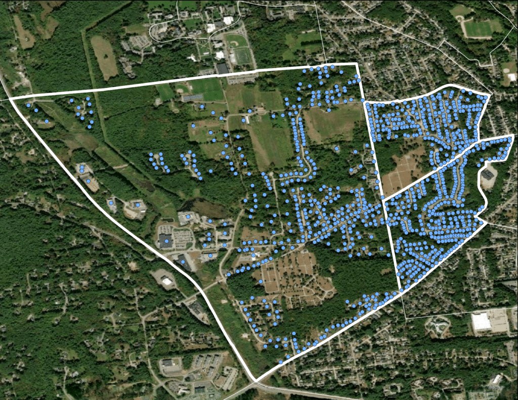
An example of a Census Block with Broadband Serviceable Locations from CostQuest’s Broadband Fabric.
First interaction with data in broadband mapping
After college, my first “real job” was with McCaw Cellular, which was when I started to work with data. At the time, Jim Barksdale was the CEO who later went on to be the CEO of Netscape, delivering quite possibly the best quote ever regarding data. He said, “If we have data, let’s look at data. If we all have our opinions. Let’s go with mine.”
The Telecom Act and big geographies: 1996-2009
The Telecommunications Act of 1996 gave us data and structure around interconnection, preemption, and universal service. The Act called for the FCC to collect broadband availability data on a semi-annual basis, which led to the birth of the FCC’s Form 477 process. This process was a mechanism the FCC would use to collect and report on broadband service availability.
In 1996, the definition of broadband was 200Kbps download, which was the perfect speed for using Jim Barksdale’s Netscape browser. As the Form 477 results started rolling out in the early 2000s, there was some satisfaction seeing what counties and census tracts had service at 200 Kbps.
The problem was that having data on broadband service availability at the census tract level was pretty much like having no data at all. Whether made by service providers for network planning or by policymakers and regulators who may provide public funding, decisions on broadband deployment are made below the census tract level. As a frame of reference on Census Geography, census tracts can contain as many as 8,000 people and span many square miles, while a census block can have as little as a zero population and be as small as 2/3rd of an acre. For specific purposes, having data at this macro-level of geography allowed policymakers and regulators to make decisions using the Barksdale Principle: opinions.
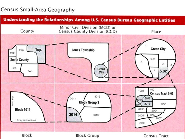
Examples of Census Bureau Geographic Entities.
Stimulus, the National Broadband Map, and CAF: 2009-2015
2009 brought us, among other things, Google’s Chrome Browser. That was also the year that the FCC started moving toward a 4Mbps broadband definition. You could use your Chrome browser to find where to buy Shake Weights (also introduced in 2009) or view the nutritional value of Hot Pockets, which expanded its market beyond college dorm rooms thanks to the Recession.
The economic downturn in 2009 led to the American Recovery and Reinvestment Act. The ARRA provided funding and limited guidance to produce broadband maps. Companies like CostQuest and Connected Nation had already performed statewide broadband maps for Wyoming (2005) and Kentucky (2005), respectively. These programs started to help define the direction of broadband mapping.
Congress and the FCC leveraged that guidance and worked to build the National Broadband Map. The goal was to collect data, standardize it, and display it at the census block level. Unfortunately, the Barksdale Principle came back into play. The timing of getting out data and maps on broadband availability did not mesh with the need to get stimulus (Broadband Technology Opportunity Program grants, or “BTOP”) funds out quickly. It left policymakers and grantors with little data and lots of opinions on where to fund broadband build-out.
The Connect America Fund (CAF) was introduced in 2011. CAF reformed the Universal Service Fund and relied very much on broadband data and the National Broadband Map results and related efforts. Continual improvement of broadband mapping brought about better modeling of costs to build to unserved areas. It allowed fund size and targeting decisions to be made with actual data driving them. This process led to more efficient public funds spending and a better public understanding of where broadband was and was not available. The Barksdale Principal data-opinion ratio moved in a positive direction.
CAF-II, RDOF, and Location-Based Mapping: 2015-2021
The year was 2015, and the FCC bumped the definition of broadband to 25Mbps down/3Mbps up. We could jump on our Microsoft Edge browser at very high speeds and find out the PSI of Tom Brady’s footballs in 2015. By this time, the census block-level data had contributed to the Connect America Fund moving to a reverse auction. Identifying eligible census blocks and reserves was measured using this more granular approach to broadband mapping. By most standards, the continual improvements in broadband mapping had yielded at least some measure of success. However, not unlike Tom Brady’s footballs, there was some deflation among those who built the networks and the public that needed bandwidth — indicating that the data was not accurate enough.
The Rural Digital Opportunity Fund (RDOF) was introduced not long after CAF-II was awarded and mostly expended. The first phase of RDOF relied on similar data and processes from CAF; however, the deflated murmurs of dissatisfaction had led to a focus on improving broadband mapping.
In 2018, CostQuest, US Telecom, and other Broadband Mapping Initiative (BMI) members worked to find a path to better data for broadband mapping. In 2019, CostQuest developed the Broadband Serviceable Location Fabric (and in early 2021, we launched more data attributes (layers of data on top of locations) to support the Fabric, which we later named the “Broadband Fabric Data Suites” ) to bring broadband mapping to the actual location of structures – places that are candidates for broadband service. This development of the Broadband Serviceable Location Fabric eventually made its way to the halls of Congress.
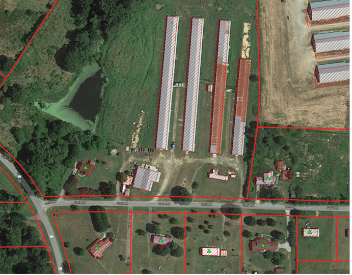
A sample from the BMI showing the process of identifying Broadband Serviceable Location Structures.
Where broadband mapping is now going: 2022
The Broadband DATA Act was passed by Congress in March of 2020 and included requirements for the FCC to use specific data collection standards and structure-level mapping. Born from this Act, was the FCC’s Digital Opportunity Data Collection, renamed to the Broadband Data Collection (BDC) program in March 2021, which builds on the Form 477 program and works to improve the granularity and accuracy of broadband mapping going forward. The ability to view broadband availability, speeds, and technology below the census block level, and on a location-by-location structure-level basis, will further improve broadband maps and the subsequent analysis and decisions derived from them.
The goal of the Broadband DATA Act and the new Broadband Data Collection process is to remove the “one-served, all-served” issue that was the unintended result of the Form 477 process, where if a provider said they provided service to a location in a census block, then the whole census block was considered “served.” It was found that some locations in census blocks considered “served” were actually unserved or underserved, thus coining the term “one-served, all-served.” The Broadband DATA Act’s new data collection requirements work to create a valid base of information that reflects the broadband needs on a location-by-location (structure-level) basis across the U.S., to create a more accurate and granular depiction of where quality broadband service is, and most importantly where it isn’t.
Will mapping broadband availability on a structure-level basis make a difference?
First off, when it comes to mapping and assessing broadband availability data, it’s about understanding where and what type of service can be provided to specific locations in an area, and organizations must know precisely where a structure is to accurately depict if quality broadband service is, or can be provided to a specific location.
Will this new broadband availability data collection system lead to less reliance on the Barksdale Principle of decision-making? After the results of the Broadband Mapping Initiative, it’s been proven better data can replace guesswork or opinions. Now two years later after the initial passing of the Broadband DATA Act in 2020, the FCC produced their first draft of the National Broadband Map in November of 2022, mapping broadband availability to individual structures in the Broadband Serviceable Location Fabric (“a common dataset of residential and business locations (structures) in the U.S. where fixed broadband internet access service is or can be installed”). This first release is a monumental milestone toward broadband mapping on a location-by-location basis and kicks off an iterative process that will yield improvements over time, bringing vast improvement over prior data collection efforts.
It is a giant step forward from the previous GIGO factor, but note no system will ever be perfect, there may always be some garbage in there. There’s also garbage in Hot Pockets, but they’re pretty darn good.